
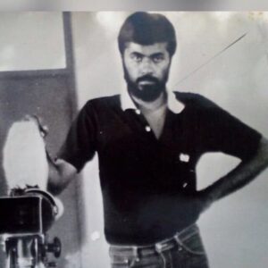
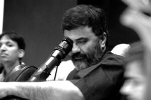
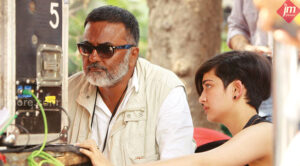
In Conversation with PC Sreeram ! part one!!
Jan 26 2025
P.C. Sreeram, a National Award-winning cinematographer and director, has revolutionized the art of cinematography in India. A true trendsetter, he has elevated visual storytelling to unparalleled heights. Honored by the Government of India at the Goa Film Festival as a “Legend of Indian Cinema,” alongside the iconic director Ramesh Sippy of Sholay, Sreeram’s contributions have left an indelible mark on Indian cinema.

An avid reader of modern literature, P.C. Sreeram’s creative vision has influenced generations. Many of his protégés have become renowned cinematographers across various languages, expanding the horizons of cinematic visualization.

In an inspiring session with SICA, P.C. Sreeram reflects on his transformative journey, offering profound insights into his craft, the evolving art of cinematography, and the power of storytelling through visuals. His legacy continues to inspire artists and redefine the boundaries of cinema.
PC Sreeram in conversation Part : one
How did photography shape your journey and identity?
Photography became my anchor. With each click, I discovered more about myself, and life grew more pleasant and meaningful. Through the lens, I found my identity and a way to express myself beyond words.
How do you view administrative tasks in your career?
I’ve never been one for the drudgery of administration. My passion lies in the creative process, not the paperwork. Photography and cinematography allow me to focus on storytelling, which is where my true energy belongs.
How do you approach lighting in your cinematography?
For me, light is not just about illumination. I see it as if the light itself wants to tell a story. When I feel the light, I ask, What story does it want to narrate here? That’s where my journey with lighting begins.
Can you share an example of this approach?
Of course. Take something as simple as a table lamp. Light can do so much more than just hit the character directly. Sometimes, I let the light strike a surface nearby—like a table or a wall—before it reaches the character. It creates a kind of redirection, a sense of surprise. You feel the light interacting with the space, not just the person.
What does this redirection of light achieve?
It adds a layer of emotion. The light becomes a character itself, shaping the mood. That soft, unexpected glow tells a story on its own. It’s not just about lighting up a face; it’s about the journey the light takes before it reaches the face. That’s where the magic is.
How do you perceive the role of light in cinematography?
For me, the cinematographer is a co-author of the film, telling the story through light. While Director tells the story with words, I narrate it with light. Light is not just an element—it’s a character that carries emotion and meaning. The morning sunlight, for instance, tells a story every day, and I never want to miss those stories. In a love story, light plays an even more significant role, as it allows me to evoke tenderness, intimacy, and connection.
Why do you prefer shooting in the mornings?
Morning light has a distinct quality—it’s soft, natural, and full of life. It’s a storyteller in itself, and I find it irreplaceable. Every morning has a unique narrative, and as a cinematographer, it’s a privilege to capture those fleeting moments of beauty.
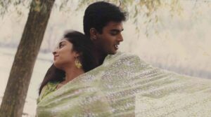
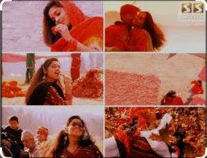
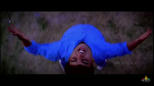
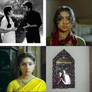
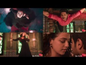
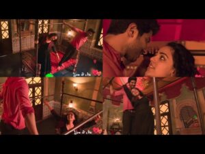
The song in Alai Payuthey uses colors as a central theme. How did you bring that to life visually?
The song’s lyrics revolved around colors and love, so it was crucial to visually capture the essence of both. However, when we reached the location, the landscape was dry and lacked the vibrant colors the song demanded. This became an exciting challenge for me, pushing my creative limits.
The lyrics emphasized specific colors—green, red, yellow, blue, black, and white—each needing its own distinct visual representation. My approach was to ensure that each color became the dominant element in its frame. For this, I meticulously composed the shots to focus on a single color at a time. I positioned subjects and elements in the frame to make the chosen color stand out naturally, but to truly bring out its intensity, I relied heavily on graduated ND filters.
Using multiple ND grads—ND6, ND3, and ND9—I placed them in random orientations depending on the desired effect. Some filters were placed from the top, others from the bottom, and even the sides, to isolate and enhance the specific color for each frame. This technique directed the viewer’s attention to the color while balancing the rest of the frame. On bright days, I worked with a depth of field at T2.8 to create a shallow focus, further emphasizing the dominant color.
At times, the sheer number of filters made it difficult to view the image through the eyepiece, but I trusted the process. The interplay of these filters and precise composition allowed me to extract the exact hues I envisioned. The result was a series of frames where each color was not only visually striking but also emotionally resonant, perfectly complementing the lyrics and the mood of the song. This intricate blending of composition and technique brought the theme of colors and love to life in a unique and memorable way.
Was there a specific color that you connected with the most?
Black. Black is the color I feel very special with. It has an incredible depth and elegance that allows for subtle yet powerful storytelling. I ensured it was given the prominence it deserved, especially in the frames where it was the focal color.
You pioneered backlighting techniques in the interiors for films like Mouna Raagam and Nayakan. How did you come up with this idea?
Back in the day, homes were designed in such a way that sunlight would beautifully pierce into the interiors at specific times of the day. A stunning natural backlight would strike, creating a magical ambiance. I used to photograph my daughter in such settings, and that experience left a lasting impression on me. Later, I brought this into my films, especially Mouna Raagam and Nayakan. It was about capturing that warm, natural glow to elevate the visual narrative and create an emotional connection with the audience.
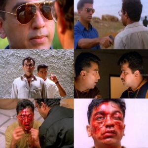
Kuruthipunal, directed by you, had striking contrasts of color, with cold blues and warm tones, and walls drenched with water leakage. What inspired this visual style?
The visual style of Kuruthipunal was carefully designed to reflect the emotional and psychological tension of the story. The cold blues represented the chilling, oppressive atmosphere, while the warm tones highlighted fleeting moments of humanity and conflict. The walls drenched with water leakage added an element of decay, symbolizing the moral and physical erosion within the narrative. These choices were deliberate to immerse the audience in the film’s intense mood.

Govind Nihalani once called Kuruthipunal “a remake that feels original.” How does that resonate with you?
Hearing that from Govind Nihalani was an honor. It’s a huge compliment because he’s a filmmaker I deeply respect. While Kuruthipunal was adapted from his Drohkaal, we treated it as a fresh canvas, reimagining the story for a Tamil audience while staying true to its essence. The idea was not just to remake but to reinterpret, and his words validate that approach.
The song Parandhu Sella Vaa in OK Kanmani has a visually striking approach. Can you share some interesting trivia about its visual style?
The visual concept for Parandhu Sella Vaa was inspired by the charm of old hotels. These spaces often have dark interiors with muted colors, creating an intimate, nostalgic atmosphere. To add vibrancy and contrast, we incorporated multi-colored glass windows that allowed vivid hues to stream into the room. This combination of muted tones and vibrant light created a unique visual language, enhancing the song’s playful and romantic mood while staying true to the film’s aesthetic.

The lighting style in Agni Natchathiram was revolutionary for Indian cinema. Can you share your thoughts on its unique approach?
The title Agni Natchathiram itself was the first thing that excited me. I told Mani Ratnam that I would shoot the film only if it kept that title—it carried such a strong visual identity. The entire project felt like a dream ride for me. My approach was to use light as a dynamic force. I wanted to stack the negative and blow light in specific areas, allowing the darker regions to reflect naturally. Shooting against the light with an intense pump of light beyond exposure control was a deliberate choice to create depth and texture.
One standout moment was the sequence with characters jumping on top of a train. We used a low-angle camera, and the quick movement of the them combined with shafts of light cutting through, gave the scene an ethereal, dreamlike quality. It was about pushing boundaries and redefining how light and shadow could tell a story.
The use of strobe lights with nearly zero visibility for the entire climax of Agni Natchathiram was a bold choice. What inspired that decision?
As the story progressed toward the climax, both I and the audience knew what was going to happen. I wanted to offer something more—an experience that heightened the tension and unpredictability. The idea was to use flickering strobe lights while the action and stunt sequences unfolded, creating a sense of chaos and urgency.
The most challenging part was framing and color grading those scenes. With the strobe lights cutting visibility to almost zero, finding a frame to color grade was tough. But I was confident I could get at least a quarter of a frame with enough light to work on during color timing. It was a gamble, but the result was an intense, unforgettable visual sequence that left a lasting impact.
The strobe lighting in the climax of Agni Natchathiram was a bold and unconventional choice. Were you concerned about how the audience might react?
Absolutely. I was aware that some audiences might not like it because it was such an unconventional approach, especially for that time. But as filmmakers, we have to step out of our comfort zones and try something new. The flickering strobe lights added a unique intensity to the climax, even though it posed challenges in framing and color grading. It was a calculated risk, and I believed it would elevate the visual storytelling and leave an impression, whether it was loved or debated.
What was your approach to achieving the unique color and tonal value in Thevar Magan?
While shooting Thevar Magan, I concentrated on maintaining a consistent soil color, ensuring it had a warm tone throughout the film. This warmth was vital to reflect the earthy, rural essence of the story. Additionally, I incorporated coconut coir floating in the frame to provide a subtle yet effective visual break, enhancing the overall texture and mood of the scenes. It was a deliberate effort to visually root the audience in the film’s environment and narrative.

The song Konjum Nilavu in Thiruda Thiruda is a spectacular blend of light and music, with a prominent use of the Nuremberg lighting technique. Could you elaborate on its execution?
Konjum Nilavu was a exciting song it required us to shoot through the nights until early mornings, creating a specific atmosphere to match the song’s mood.
At that time, we didn’t have modern DMX facilities to control lights seamlessly. Adjusting the lights from 0 to 100 intensity was a manual process, done using dimmers, flags, and other techniques. We worked with over 50 lights, each needing precise operation. My assistants and light officers were given specific tasks to ensure every light was adjusted in perfect harmony.
Lighting wasn’t just about illumination; it was integral to the composition. Even for a close-up shot lasting a few seconds, there would be two or three light variations to enhance the depth and drama on the music.The meticulous planning and teamwork behind each frame brought a unique, larger-than-life quality to the visuals, making the song sequence a standout.
The song Thee Thee in Thiruda Thiruda is known for its dynamic crash zoom technique, which later became very popular. How did that technique come about?
The crash zoom technique in Thee Thee was actually a spontaneous decision made by Mani Ratnam and me, just the morning before the shoot—around 7 AM. It wasn’t planned in advance, but once we discussed it, we quickly decided to go ahead with it.
The timing, the energy of the song, and the location all came together, and the crash zoom became a signature style that later gained popularity in filmmaking. It was one of those moments where instinct and collaboration brought something unique to the screen.

Paa is a visually stunning film about a rare genetic disorder. How did you achieve the image manipulation to make Amitabh Bachchan appear as a child with a dwarf-like stature?
When I read Balki’s script, I realized that the visual treatment had to align with the story’s emotional depth. To achieve Amitabh Bachchan’s appearance as a child with a rare genetic disorder, we used a technique called reverse perspective.
For Amitabh’s character, I shot with an extreme wide-angle lens and positioned the camera at a higher angle. This created the illusion of a smaller stature while maintaining proportionate body dynamics. Careful attention was given to blocking and framing to enhance the perspective distortion subtly. The challenge was to ensure that the visual manipulation felt organic and not gimmicky, allowing the audience to emotionally connect with the character. The result was a seamless integration of technical precision and storytelling.


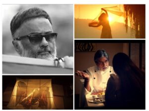
How did you approach the cinematography for Ki & Ka considering its unique storytelling?
Ki & Ka is a very candid film centered around two people and their evolving relationship. The challenge was to capture the candidness at just the right moment, which is easier said than done. Missing that precise point of candidness would risk losing the essence of the film.
How did you use the camera to convey the bond between the characters?
The camera had to speak the language of bonding; otherwise, the film would lose its connection with the audience. If you don’t feel the love, the agony, and the bond between the characters, the story won’t resonate. I wasn’t shooting a drama—it had to feel real. For instance, establishing a scene with a wide lens while they are sitting in their house helps convey their space and relationship naturally, setting the stage for what happens next in their life.
What inspired your choice of the color palette for the film?
PC Sreeram: Since the film explores love after marriage, the romance around the characters had to feel vibrant and lively. I chose a distinct color palette to reflect this. The colors speak for themselves, and as the story unfolds, you’ll see how the palette helps evoke the right emotions in the audience.
Why did you choose vinyl backgrounds over green screens for this project?
The film’s indoor scenes are primarily set in a Delhi house, though the set was created at Yash Raj Studios in Mumbai. I chose vinyl backgrounds instead of green screens because I needed to maintain the natural flow of light. Rupin Suchak, the art director, helped me select high-quality vinyls with vibrant saturation and a softness that didn’t show any sharpness, which would have ruined the experience. Green screens would have disrupted my lighting ratio and flattened the visuals, and as a cinematographer, I cannot compromise on the interplay of light and shadow. It’s all about balancing what is seen, what is not seen, and what needs to be seen.
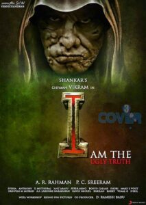
The visuals in Shankar’s I were groundbreaking. How did you approach the lighting to achieve such variety?
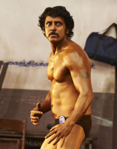
A: The film required a wide range of lighting techniques to suit the diverse moods and settings. For example, in the bodybuilding portions featuring Lingeswaran, we used strokes of warm specular lights to highlight parts of the body, enhancing texture and offering the audience a closer, detailed look. This approach made the physique stand out dynamically on screen.
The transformation of Vikram’s character to the hunchback was striking. How did you handle lighting for those scenes?
For the hunchback transformation, I opted for soft lighting. The idea was to make Vikram’s face look appealing and expressive despite the lumps. Soft lighting helped bring out the emotional depth while maintaining a balance of beauty and realism.

What was it like working on such a visually ambitious project with director Shankar?
It was an extraordinary experience. Shankar’s thirst for exploration pushed us to constantly innovate. The challenges, song concepts, and the stunning locations in China were truly memorable. Some of those places were so surreal that I didn’t even believe they existed until we shot there. It’s a project I’ll always cherish.
What is your perspective on the role of cameras and lenses in storytelling?
For me, the eye is the true camera—it defines perspective and shapes the story. While equipment is secondary, the perspective and intuition you bring are crucial. It’s about understanding the natural rhythm, music, and graph of each film and ensuring that the lens aligns with that rhythm to create compelling visuals.
In today’s digital era, the eyepiece has become vital to my process. I ensure that the digital cinema cameras I work with have a well-calibrated eyepiece. while ensuring my lighting values are accurately represented. In this regard, the Arri Alexa has been an excellent fit for my workflow.
You are considered one of the early pioneers of digital filmmaking in our country. With the advancements in digital cameras today, which film from your motion picture filmography would you revisit?
Agni Natchathiram would be an ideal choice.
conversation continues….!
Article by
CJ Rajkumar