
Visual Journey: Ravi K Chandran!
Jun 20 2025
🎥 The Eye Behind India’s Most Iconic Frames
Ravi K. Chandran ISC on Thug Life and on his earlier films Visual Innovation & Crafting Cinematic History
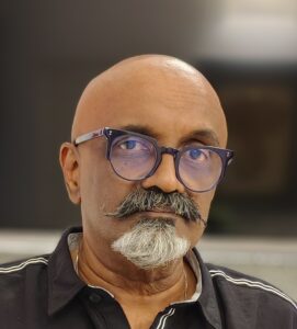
From Virasat to My Name Is Khan, Ravi K. Chandran ISC has been a force behind some of Indian cinema’s most unforgettable imagery. Known for fusing emotion with precision, and experimentation with elegance, he continues to push the boundaries of visual storytelling. In this candid conversation with SICA, he dives deep into his work on Thug Life with Mani Ratnam and Kamal Haasan, reflects on his pioneering use of tools like Cooke lenses and DI grading, and shares timeless wisdom for the next generation of cinematographers.
🎬 What excites you most about reuniting with Mani Ratnam for Thug Life, three decades later?
Ravi K. Chandran:
Shooting Thug Life is special—emotionally and creatively. Mani Ratnam has sculpted deep human emotions into every frame. That excites me.
What I love about working with Mani is the unpredictability. Each day brings a chance to improvise. He directs with instinct and clarity—he knows exactly when to shoot a scene, what the light should be, and inspires everyone around him to rise to the moment.
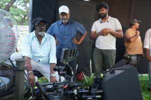
📷 You’ve always embraced new technologies. What did you try for the first time here?
For the first time in my career, I used Cooke lenses.
We chose Cooke Anamorphic FF for the film’s warmer, emotionally grounded first half. Then switched to Cooke S8/i spherical lenses for the second half, which has a cooler, emotionally heavier tone. Paired with the Alexa LF, the large format gave us exquisite depth of field and smoother fall-off.
I mostly shot at T4—it gave just the right cinematic softness and depth.
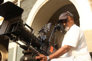
🌅 What was your lighting strategy for Thug Life?
My core approach hasn’t changed over the years—
Day interiors remain semi-dark with natural ambience, while nights rely on a single dramatic source—like a tube light or tungsten glow.
We used a mix of specular lighting, 24K tungsten units, and indirect sources to create rich, moody visuals—especially in dusk sequences. The teaser’s black-and-white smoke across barren Chennai landscapes? That was a tone-setter—gritty, atmospheric, expansive.
💡 You’ve pioneered many lighting techniques. Any standout invention?
Yes—Using Miniflos, C stands Arri sky panels, Spacelights.
Tiny fluorescent lights small enough to fit inside glass bottles.
It was a game-changer in ad films—creating a surreal glow from within the product. Later, I transitioned this to cinema—films like Virasat and Dil Chahta Hai used soft yet contrast-rich lighting, which influenced the visual aesthetic of an entire generation.
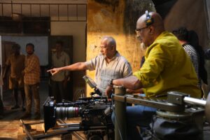
🎞️ Why did you favor 28mm and 35mm lenses for Thug Life?
These focal lengths allowed me to get physically closer to the actors, giving them an epic presence on screen.
That closeness helps audiences connect with the character’s emotions—it’s intimate, immersive, and cinematic. You feel with them, not just watching them.
☀️ You often talk about India’s sunlight. How does it affect your shoot planning?
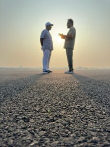
Indian sunlight is brutal—and beautiful.
After 8 a.m., the sun rises fast and high, creating harsh angles and quick shifts. Unlike Europe, where you get stable light for hours, here we must constantly adapt.
It affects everything—blocking, lensing, even makeup continuity. But if you learn to master it, Indian light gives you unmatched textures.
🎥 You’ve worked with both Mani Ratnam and Sanjay Leela Bhansali. How different are they?
Both are masters—but polar opposites.
Bhansali is all about symmetry, opulence, and meticulous visual structure.
Mani is instinctive, raw, and rooted in naturalism.
If I’d only worked with Sanjay, I wouldn’t have survived Mani’s speed and spontaneity. Each taught me different ways to see, feel, and shape a story visually.
🌍 Your experience at Camerimage and thoughts on global exposure?
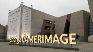
Camerimage was an eye-opener.
Meeting icons like Vittorio Storaro, trading thoughts with cinematographers from around the world—it pushed me to look beyond what I knew.
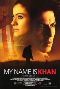
Getting nominated for My Name Is Khan at the Golden Frog awards made me feel our work was truly crossing borders.
🎬 How did you approach the visual style for Yuva compared to other Mani Ratnam films?
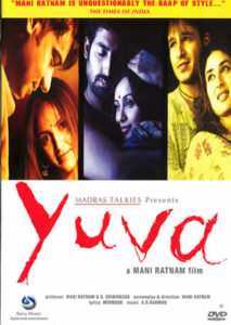
Yuva needed three distinct visual languages to reflect its three protagonists’ inner worlds:
Lallan’s track used wide-angle lenses and handheld camerawork to capture his aggression and chaos.
Michael’s portions were framed with precision and symmetry, reflecting his composed, idealistic nature.
Arjun’s story was shot with telephoto lenses and soft backgrounds to evoke his dreamy detachment and lack of focus.
While each storyline had its own aesthetic, the overall challenge was blending them seamlessly into one cohesive film.
🎨 How did you use color palettes to enhance each character’s arc?
We designed subtle but distinct color palettes:
Lallan’s world had dominant reds and blacks—reflecting anger, tension, and violence.
Michael’s scenes used earthy tones and soft light to signify calm and clarity.
Arjun’s spaces were cooler in tone—blues and pastels that hinted at his youthful aspirations and emotional distance.
The palettes extended to costumes, locations, vehicles—even props—always grounded, never flashy. The audience feels the contrast rather than consciously noticing it.
🎥 Why were different lenses and camera styles chosen for each character?
Each lensing choice supported the character’s psychological state:
Lallan’s handheld wide shots brought out the volatility and unpredictability of his life.
Michael’s structured, balanced frames echoed his moral center and leadership qualities.
Arjun’s long-lens treatment isolated him from his surroundings, visually showing how disconnected he was from reality.
These weren’t just stylistic decisions—they were emotional storytelling tools.
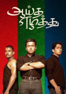
🌆 How did the visuals differ between Yuva and Aayutha Ezhuthu?
Though both films shared the same structure, we shot them separately and tailored the visuals to each version’s cultural setting.
In Yuva, Kolkata gave us layered textures and visual grit—especially for Lallan’s story.
In Aayutha Ezhuthu, Chennai’s urban rhythm influenced our lighting, framing, and color tones to match the Tamil cultural context.
Even the emotional tone shifted slightly, so we recalibrated performances and visuals accordingly—while keeping each character’s identity distinct.
🤝 What was Mani Ratnam’s role in shaping the visual storytelling?
Mani Ratnam’s vision was clear from the start—three parallel journeys that converge, each needing its own look and rhythm.
He’s a master of subtlety. Nothing is overdone. He gave me full freedom to experiment, but every decision had to serve the emotional core of the story. Our discussions were always about why a scene should look a certain way—not just how. That’s what made it special.
🎬 How did you develop the visual style for Black to reflect its unique narrative?
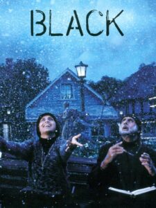
Black was about seeing through the absence of sight. The visual language had to immerse the audience in Michelle McNally’s deafblind world, yet still remain emotionally accessible.
We chose a muted palette—blacks, greys, and blues—to mirror her sensory isolation. Light became our metaphor: soft, natural illumination through windows represented knowledge and hope, especially in the scenes where Debraj begins to teach her.
Close-ups of hands and textures anchored the tactile reality of Michelle’s world. Every frame was carefully composed to feel both intimate and expansive, mirroring her personal confinement and eventual growth.
You were among the early pioneers to use DI in India. Tell us about that moment.
Black was a turning point.
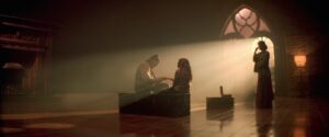
We needed to show the mansion’s vast, lonely feel—so we polished the floors and lit with intent. DI (Digital Intermediate) was still new in India. We scanned the negatives and tried post-processing in Australia, but delays made us finish it at Prime Focus India.
This wasn’t about enhancing—it was about preserving what we captured on film. It wasn’t perfect, but it was bold. I believe Black was the popular Indian feature fully graded via DI.
💡 What role did lighting play in shaping the emotional tone of Black?
Lighting was the emotional spine of Black.
We created a cold, isolating mood in the McNally home using diffused daylight and shadow play, letting light drift softly through large windows without ever feeling warm. But when Michelle experiences breakthrough moments—like the “water” scene—we subtly shifted the light, adding glows of warmth to mark emotional transitions.
Candlelight in the church sequence brought a spiritual glow, contrasting Michelle’s darkness with a sense of divine presence. Every lighting choice served a psychological purpose, framing isolation and enlightenment side by side.
🎥 How did lensing choices contribute to the film’s intimate and symbolic visuals?
Details mattered: the grain of Michelle’s fingers, the texture of fabric, the subtle shift in expression. lens and composition is to amplify the senses she did possess, bringing the audience closer to her lived experience.
Wide shots were minimal but deliberate—used to highlight the emotional vastness and silence of the McNally home. Every shot had to feel honest, poetic, and grounded.
🎨 How did your collaboration with Sanjay Leela Bhansali shape the cinematography?
Sanjay envisioned Black as a painting—stripped of color but rich in feeling.
Unlike his usual opulent frames, this film required minimalism with meaning. We discussed how to use light, shadow, and space to reflect themes like knowledge, spirituality, and resilience.
He trusted me to interpret symbolism through visual grammar—slow pans, static compositions, and careful reveals. Whether it was a shaft of light on a cathedral wall or a flicker of flame on a student’s face, we crafted every image to feel weighted yet graceful.
How did production design complement your cinematography?
Sabyasachi Mukherji’s production design was a natural extension of the cinematography.
The McNally house—with its towering ceilings, austere furniture, and religious iconography—gave us both grandeur and loneliness to work with.
We used wide frames to show spatial emptiness and close-ups to explore emotional intensity. Elements like poetry-inscribed walls in Debraj’s quarters were lit in a way that invited deeper meaning. The textural richness of the set—wood, stone, and fabric—echoed Michelle’s sense of touch and grounded our visual storytelling.
🎶 How did the absence of songs affect your visual approach?
With no songs, the visual rhythm had to sing on its own.
We leaned into stillness, silence, and shadow—letting the background score breathe without competition. Scenes like Michelle’s solitary walk through the candlelit church became visual symphonies, where light and pace did the emotional lifting.
In moments like the graduation sequence, we used slow tracking shots and warm tones to heighten triumph through visual grace. Every frame had to carry weight—composition, light, and movement became our emotional chorus.
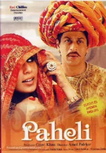
🌾 How did you approach the visual style for Paheli (2005) to capture its folklore and fantasy?
Paheli is a timeless fairytale rooted in Rajasthan, so the visuals had to feel magical yet grounded.
We leaned into a rich, intoxicating color palette—deep reds, marigold yellows, and antique golds—to reflect the cultural vibrancy and surreal undertones of the story. Every frame was composed like a painting, with fluid camera movements enhancing the ghostly transformations and romantic moments.
Warm, glowing light created a sense of enchantment, especially in dreamlike sequences like “Laaga Re Jal Laaga.” The goal was to make Rajasthan feel otherworldly—as if reality itself were bewitched.
🔆 What role did lighting play in shaping Paheli’s mood and magic?
Lighting was the soul of Paheli.
We captured natural golden light during dawn and dusk to give Rajasthan an eternal glow. In desert scenes, diffused sunlight revealed texture in the sands without harshness. Indoors, we used practical lighting—lanterns and candles—to create intimacy and mystery, especially in scenes involving the ghost.
The lighting subtly shifted between realism and fantasy, enhancing the contrast between Lachchi’s routine village life and the ghost’s magical presence.
🎥 How did lensing and camera techniques support the storytelling?
Wide shots highlighted the grandeur of the desert and havelis, while close-ups brought out the emotional intensity of the ghost and Lachchi. Song sequences like “Laaga Re Jal Laaga” featured graceful dolly and crane movements, syncing with choreography and enhancing the fairytale mood.
Our camera language danced between realism and dream, mirroring the story’s magical duality.
🎬 How was the collaboration with Amol Palekar and Shah Rukh Khan?
Amol Palekar brought a gentle, actor-focused vision to directing. He wanted Paheli to feel poetic, and he gave me the space to visually interpret that.
Shah Rukh called me personally to join the film. His dual role as Kishanlal and the ghost required visual nuance—we used subtle shifts in lighting and posture to differentiate the two personas.
Together, Amol’s understated style and Shah Rukh’s dynamic performance allowed for a visually bold yet emotionally restrained approach.
🏜️ What challenges did you face while shooting?
Recreating Rajasthan in Mumbai’s Film City was the biggest challenge. With limited time in the real desert, we brought back sand to build artificial dunes.
We shot on the helipad using giant fans, camels, and sculpted lighting to recreate the feel of the Thar. Matching the color, light, and texture between real and artificial locations took precision—but we succeeded in making the transitions invisible to the viewer.
It pushed us to innovate—and deliver Rajasthan on reels.
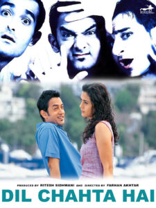
How did you shape the visual style of Dil Chahta Hai to reflect its modern, urban narrative?
Dil Chahta Hai was a turning point—a story about youth, friendship, and change told with a new language. The visuals had to feel fresh, clean, and emotionally real.
We used a natural, vibrant palette—cool tones in urban Mumbai, warm blues and greens in Goa. Camera work was fluid and intuitive: tracking shots for road trips, tight close-ups for raw emotion. Every frame aimed to reflect a sense of freedom, introspection, and connection, all in tune with Farhan’s modern vision.
💡 What role did lighting play in setting the film’s tone?
Lighting had to feel effortless yet expressive. In Mumbai, we used soft window light and real interiors to create a refined, lived-in feel.
Goa was lit by golden hour sun, bathing the beach scenes in warmth and nostalgia. Emotional scenes—like Tara’s apartment or the opera sequence—relied on low-key, intimate lighting to heighten vulnerability. The light always supported the emotion, never distracting from it.
🎥 How did lenses and camera techniques elevate the storytelling?
Wide-angle shots captured the freedom of open roads and forts in Goa.
For personal moments, we went tighter—standard lenses and slow tracking to draw audiences into the character’s emotional state. “Tanhayee” was built on minimal movement, close frames, and a haunting stillness. Our choices aimed for emotional truth with visual polish.
🎬 How was your collaboration with Farhan Akhtar?
Farhan came in with a clear, fearless vision. He wanted to break the mold—no melodrama, no over-lighting—just grounded, global storytelling.
We synced instantly. He gave me the freedom to explore light, angles, and rhythm, always tying it back to character. We weren’t just capturing cool frames—we were building a new cinematic language.
🎶 How did you approach key song sequences like “Dil Chahta Hai” and “Tanhayee”?
For the title track, it was all about energy—steadicam, crane shots, vibrant daylight, capturing the thrill of youth and friendship.
“Tanhayee” was the opposite—still, shadowed, and internal. Slow moves, tight framing, and low light gave it emotional gravity. We choreographed each shot with Farah Khan and Farhan so the visuals sang with the music—never ornamental, always emotional.
🎓 Q: Your advice for young cinematographers?
“Don’t play safe. Take risks. Break patterns.”
Legends like Balu Mahendra, P.C. Sreeram, and Santosh Sivan didn’t follow rules—they rewrote them. That’s how you grow.
Cinema is a gift. Use it wisely. Learn light. Study color. Try new tools. And never stop learning from the set, the street, or the sky.
CJ Rajkumar
Author/ Cinematographer
