
Color Influence in Cinema: past & present!
Sep 18 2025
The Evolution of Color in Cinematography: From the 1950s to the Digital Era


Why Colors Influence Cinematography
Color has always been a language beyond words. It constructs mood, defines atmosphere, and deepens the emotional resonance of stories. Filmmakers rely on color psychology to subtly guide audience perception:
- Red evokes passion, violence, or danger.
- Blue signals calm, detachment, or melancholy.
- Green hints at fertility, nature, or unease.
- Yellow suggests energy, warmth, or caution.
From controlled studio lighting to complex digital grading, cinematographers use saturation, contrast, and palette to trigger subconscious audience responses. Thus, color is not ornament—it is narrative itself.
Global Developments in Color
- 1950s: Eastmancolor democratized color cinema, replacing the three-strip Technicolor process. Hollywood embraced bold palettes in musicals and westerns (Singin’ in the Rain, The Searchers), while European auteurs experimented with restrained naturalism.
- 1960s–1980s: Improvements in color negative film (Kodak, Fuji) gave filmmakers freedom for realism or hyper-stylization. Masters like Stanley Kubrick (Barry Lyndon) and Vittorio Storaro (The Conformist) used color as thematic architecture rather than embellishment.
- 1990s–2000s: Digital Intermediate technology changed post-production. The Coen Brothers’ O Brother, Where Art Thou? pioneered digital grading, opening the door to stylized palettes that were previously impossible.
- Digital Era (2010s–Now): LUTs, HDR, Rec.709, and log-based workflows allow precision control over tone and consistency across exhibition platforms. Color grading today is central to visual identity—from Blade Runner 2049’s neon noir to Wes Anderson’s pastel universes.
Indian Cinema’s Embrace of Color
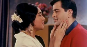
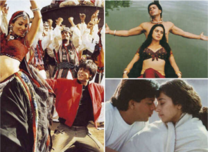
- Early Pioneers (1950s–60s): India quickly embraced Eastmancolor. Raj Kapoor’s Sangam (1964) brought grand romantic visuals to the mainstream, while AVM Productions in Chennai experimented with early color films that shaped South Indian cinema.
- Marcus Bartley: A visionary cinematographer, Bartley introduced advanced lighting design to Indian cinema. His work in Maya Bazaar (1957) seamlessly integrated color and fantasy, influencing generations of Indian visual storytelling.
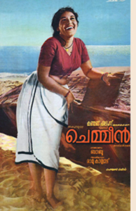
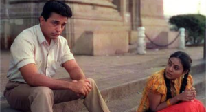
- Chemmeen (1965): Directed by Ramu Kariat and shot by Marcus Bartley and U. Rajagopal, Chemmeen was a milestone in natural color cinematography. Its use of coastal Kerala landscapes, natural light, and subtle color contrasts won the National Film Award for Best Feature Film and global recognition (Cannes, 1965). It proved that Indian films could achieve international impact through color aesthetics rooted in local landscapes.
- 1970s–1980s: With ORWO color stock, cinematographers like A. Vincent and later Nivas experimented with subdued realism. Balu Mahendra transformed Indian cinematography by rejecting theatrical lighting, instead using available light and muted palettes (Moondram Pirai, Veedu). His visual grammar drew international admiration for its lyrical realism.

- 1990s–2000s: Color became a sophisticated narrative device. P.C. Sreeram redefined Indian cinematography with daring palettes, chiaroscuro lighting, and color symbolism (Nayakan, Alaipayuthey). Santosh Sivan fused painterly textures with international sensibilities (Roja, Dil Se), projecting Indian visuals to global audiences.
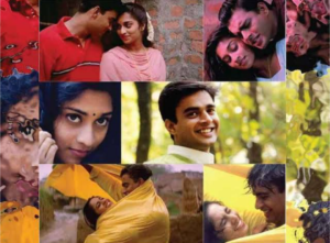

- Digital Era (2010s–Now): Indian cinema fully embraced DI and digital color grading. From the earthy realism of Malayalam cinema (Kumbalangi Nights) to neon-drenched Bollywood spectacles (Gully Boy), color now defines genre and identity. Digital workflows allow Indian cinematographers to match international standards while retaining local aesthetics.
International and Indian Impact
- Globally, color evolved from spectacle to subtle narrative instrument.
- In India, pioneers like Raj Kapoor, Marcus Bartley, and films like Chemmeen proved that color could reflect cultural authenticity while achieving international recognition.
- Visionaries like Balu Mahendra, P.C. Sreeram, and Santosh Sivan transformed Indian cinematography into a globally respected visual language.
- Today, Indian cinema contributes to international color aesthetics—balancing cultural roots with cutting-edge digital innovation.
Textures, Contrast, and Color in the Digital Age – Benefits & Drawbacks
Benefits
- Digital Intermediate (DI)
- Fine control of contrast, saturation, and hue not possible with photochemical timing.
- Ability to match shots from different days, weather, or lighting conditions.
- Expanded creative looks (sepia washes, bleach bypass, neon palettes, teal-orange separation).
- Higher ISO Digital Cameras
- Greater sensitivity: cinematographers can shoot with practical lights (candles, lamps, neon signs) while preserving color.
- More shadow detail and highlight latitude compared to older film stocks.
- Enables naturalistic styles and faster shooting with less lighting equipment.
Drawbacks
- Digital Intermediate (DI)
- Risk of over-grading: unnatural skin tones, artificial contrasts, or loss of photographic integrity.
- Temptation to “fix it in post” can reduce discipline during on-set lighting.
- Excessive stylization may age films quickly compared to the timelessness of well-shot film stock.
- Higher ISO Digital Cameras
- High ISO can introduce digital noise, which lacks the organic feel of film grain.
- Overly clean images sometimes appear “plastic” or clinical, reducing the tactile texture that film naturally had.
- Overexposure or poor highlight handling can cause unnatural clipping, especially in cheaper digital cameras.
- Cinematographers risk losing discipline in light design because digital sensors forgive underexposure more than film.
Core Contrast: Film vs Digital
- Film grain = organic texture, tied to emulsion and chemistry.
- Digital noise = algorithmic, often harsh, lacks emotional warmth.
- DI freedom = incredible control, but also possibility of excess and homogenization of visual styles.
- High ISO flexibility = liberates cinematographers, but can lead to visual flatness if contrast and texture are not reintroduced intentionally.
👉 In summary:
Digital tools expanded color and contrast into infinite possibilities, but they also introduced challenges—risking artificiality, over-processing, and loss of the “soul” of film texture.
Conclusion
From the 1950s to the digital era, color in cinema evolved from novelty to necessity, from aesthetic flourish to narrative essence. Both globally and in India, every technological leap—from Eastmancolor to DI to HDR—expanded the expressive power of cinematographers.
Indian pioneers like Marcus Bartley (Maya Bazaar), Chemmeen’s naturalistic visuals, Balu Mahendra’s realism, and the stylized visions of P.C. Sreeram and Santosh Sivan demonstrate how India not only absorbed global trends but also reshaped the international conversation on color in cinema.
Color today remains one of the most profound tools for visual storytelling, ensuring cinema’s emotional and psychological impact across cultures.
Drafted by
CJ Rajkumar
Author/ Cinematographer