Contrast : CJ Rajkumar
Jun 08 2020
Contrast is the most used word by cinematographers, Gaffers and colorists in film Industry.Contrast is a term that applies to several aspects of filmmaking: contrast ratios with lighting, contrast adjustments in color correction software, contrast in color, contrast in compositional shapes — the list goes on — but primarily, contrast refers to tone.
Principle of Contrast & Affinity states: The greater the contrast in a visual component, the more the visual intensity or dynamic increases. The greater the affinity in a visual component, the more the visual intensity or dynamic decreases.
Contrast = Greater Visual Intensity
Affinity = Less Visual Intensity
In his book, “The Art of Color”, Johannes Itten describes the seven kinds of color contrast:
1. Contrast of Hue
2. Light-Dark Contrast
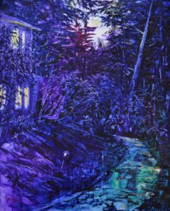
3. Cold Warm Contrast
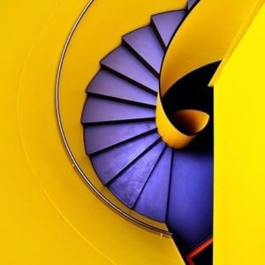
4. Complimentary Contrast
5. Simultaneous Contrast
6. Contrast of Saturation
7. Contrast of Extension
Contrast of hue simply refers to the contrast of colors at their most pure and intense state…Looking at the additive primaries and their compliments (the subtractive primaries) reveals the most obviously contrasting hues.
Red/Cyan
Green/Magenta
Blue/Yellow
The intensity of contrast of hue is reduced as the hues used are removed from the primaries by reducing the chroma
(saturation or intensity)
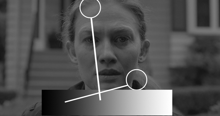
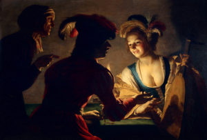
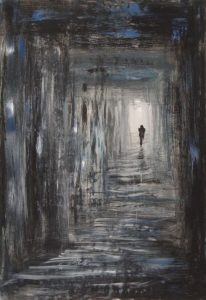
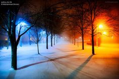
2. Light-dark contrast is the most fundamental contrast known to nature (day and night). White and black are complete opposites. White contains all the wavelengths that comprise the visible portion of the electromagnetic spectrum and black is the absence of all light. All the shades of gray exist somewhere in conflict between light and dark.
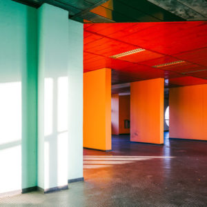
Cold-warm contrast refers to the way in which colors affect us emotionally, and not with regard to actual temperature. Orange/Yellow are warm colors and magenta, blue and cyan are cool colors. Compositionally speaking, cool colors tend to recede while warm colors appear to approach the viewer. Cinematographer P.C.Sreeram used warm light in Shankar’s I for Vikram body building episode to bring body close audience attention.Claude Monet observed that light and shade, reflection and refraction resolved the color of objects into elements of cold and warm as well as variations of light and dark.

Complimentary contrast refers to the most extreme color contrast. In pigments (subtractive color theory) complimentary colors combine to make black. In light (additive color theory) complimentary colors combine to create white. When complimentary colors are adjacent to one another, they“incite each other to maximum vividness, when mixed they annihilate each other, reducing the chroma value to nothing.”

Simultaneous contrast results from the fact that for any given color the eye simultaneously requires the complimentary color, and will generate it spontaneously if it is not already present. The presence of this simultaneous complimentary color is purely a sensation in the eye of the viewer and is not objectively present.


Contrast of Saturation relates to the purity of hue or chroma of a color. This is the contrast between pure intense colors and dull or diluted colors. The hues produced by the dispersion of white light are colors of maximum saturation or intensity. Colors become less saturated, less pure when they are diluted with white or black or when mixed with their complimentary colors. When working with light and photography, a hue that is pure and is photographed at key will be the most saturated. When the exposure is either increased or reduced, the intensity of the hue will be altered in proportion to the variation in density as depicted on the film’s characteristic curve.
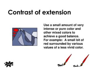
7. Contrast of Extension relates to the contrast between two areas of varying size within the composition. The two factors that determine the force or impression of a pure color are its brilliance and its extent. To determine brilliance, one must compare the colors to a neutral gray background of medium brilliance. An 18% gray or middle gray card works well for this purpose. When we do this, we can see that the intensity or light values of the primary and secondary hues are different. Goethe set up approximate numerical ratios for these values based on his own
experiences. Goethe’s light values are: yellow – 9 orange- 8 red- 6 violet – 3 blue- 4 and green-6
If we remember that Goethe was working with pigments and not light we understand that yellow and violet are opposite on the color wheel. Here we can see that yellow and violet. Both of maximum purity (intensity) will have different apparent luminance values. Goethe determined: “ Given equal hue, yellow will appear brighter than any of the other colors. Therefore, yellow in a composition will command more attention. If one seeks to create harmony and balance, then one must reduce the area of yellow using the reciprocal values to determine the correct proportions. In other words, yellow is three times as luminous as violet, so one would expect that yellow would
occupy 1/3 the area of its compliment, violet (if one intends to create harmony and balance).”
Contrast is the visual ratio of different tones in an image. This difference is what creates the textures, highlights, shadows, colors and clarity in a frame.

Drafted by
CJ Rajkumar (Author/Cinematographer)